Elevate your Nonprofits’ Graphics: Design Principles 1.0
Even without a designated graphic designer, your nonprofit can curate meaningful and visually-stunning designs that amplify your mission and impact. Visual design elements are a core component of every nonprofit’s work. However, getting started with graphic design can feel intimidating for those of us who lack design-specific training. This blog will break down the three basic pillars of graphic design—type, color, and layout—so that even the most beginning graphic designer feels empowered to design beautiful and effective content for your organization. These design principles can be learned and mastered by anyone. Read on to see how.
Choose your type carefully.
Choosing the right font for your design will impact the communication of your ideas as well as the feeling behind them. The right font balances readability with the emotion you wish to invoke in your audience. For example:
Typefaces that have rounded edges typically have a friendlier look and may set a comfortable tone with your audience. Quicksand is a great option.
Typefaces with sharp edges communicate a solid and strong message. Try out a sans serif font.
Serifs have a stylish and graceful look, an effective choice for event flyers or business cards.
Notice how the social media designs below use careful font choices to reflect the context, audience, and mood of their content:


Importantly, limit the typefaces in your design. Stick to one or two. Otherwise, your design will feel cluttered and visually overwhelming.
One effective technique is to keep your font in the same family. For example, use the same font for different text, but mix bold, italics, and condensed to increase versatility and emphasize certain ideas.
If you want to use multiple fonts, try out these effective font pairings.
Notice that these examples still limit their fonts to two.
-
This pairing is effective for event promotions and flyers (see examples below). Funky typefaces include Birra, Custard, Funkydori, Glodok, Mythos, and Whomp. Clean typefaces are often Sans Serif fonts (e.g., Open Sans, Multi Display, Depot New, Roc Grotesk, Forma DJR, Raleway, Roboto, and Condor). Be sure your funky font is still readable though!
-
Use this pairing for social media posts or ads (see examples). Stylish typefaces include Bungee, Usurp, Embryo, Hobeaux Rococeaux, Lora, and Gurkner. Simple typefaces are Forma, Elza, Open Sans, Articulat CF, Lato, or Roboto.
-
This pairing is effective for formal communications (see examples). Bold typefaces include Monarcha, Mundial, Greycliff, Oswald, Archivo Black, and Elza. Modern typefaces are Ofelia, Avant Garde Gothic, Kallisto, Bebas Neue, Source Sans Pro, or Forma DJR Display.


2. Know your colors.
As you’ve likely noticed in the previous examples, colors also have a huge impact on how a design conveys information and emotion. With a little knowledge about color theory, you can successfully communicate the intent of your design simply through the tone you set with your colors. Color theory is about how colors make us feel. This is how you can leverage your design to tap into your audience’s emotional reactions.
To start, choose a simple color scheme with 1-3 primary colors and 1-3 secondary colors for contrast. You can create a brand color palette on platforms like Canva (read this blog to learn how). Less is often more when it comes to colors. If your font is thin, you’ll need a darker background color for readability (see example below).

To ensure the accessibility of your design, choose colors that are high in contrast and adjust your font size, weight, and style accordingly to make your text readable. We like this free tool to determine if your colors have enough visible contrast for readability and accessibility.
When choosing your colors, draw upon these four core color combinations.
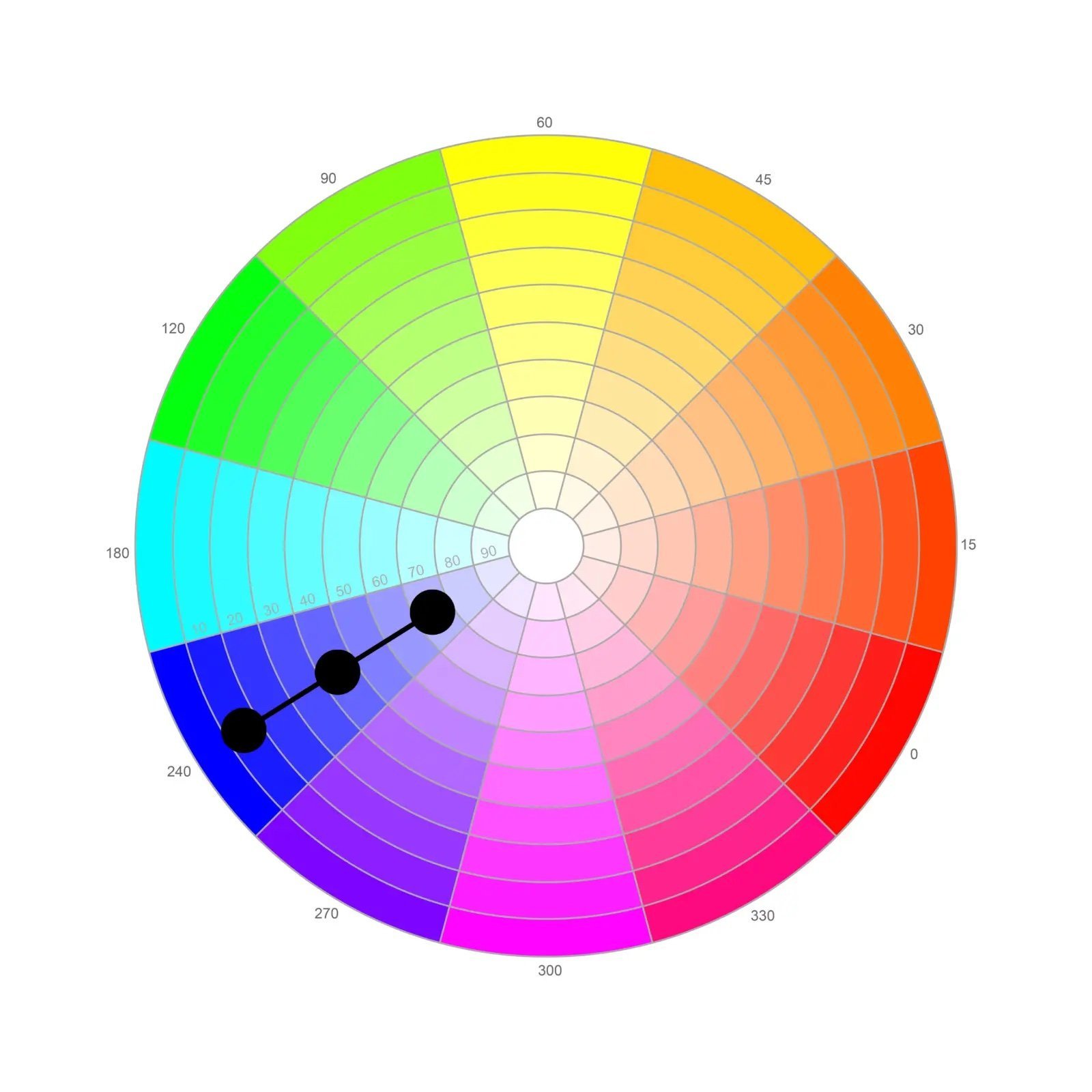
-
These are the same color but in different shades or tones (see the blues highlighted below). Monochromatic color schemes are simple and clean.
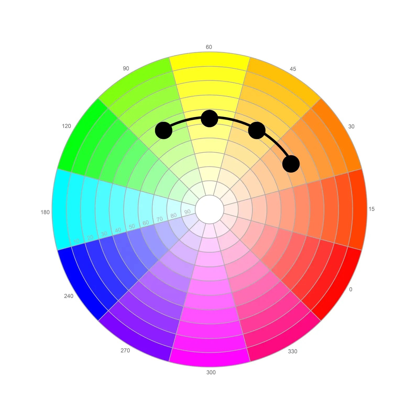
-
These are a group of colors that are next to each other on the color wheel (see below). Analogous color schemes communicate a sensation of unity.
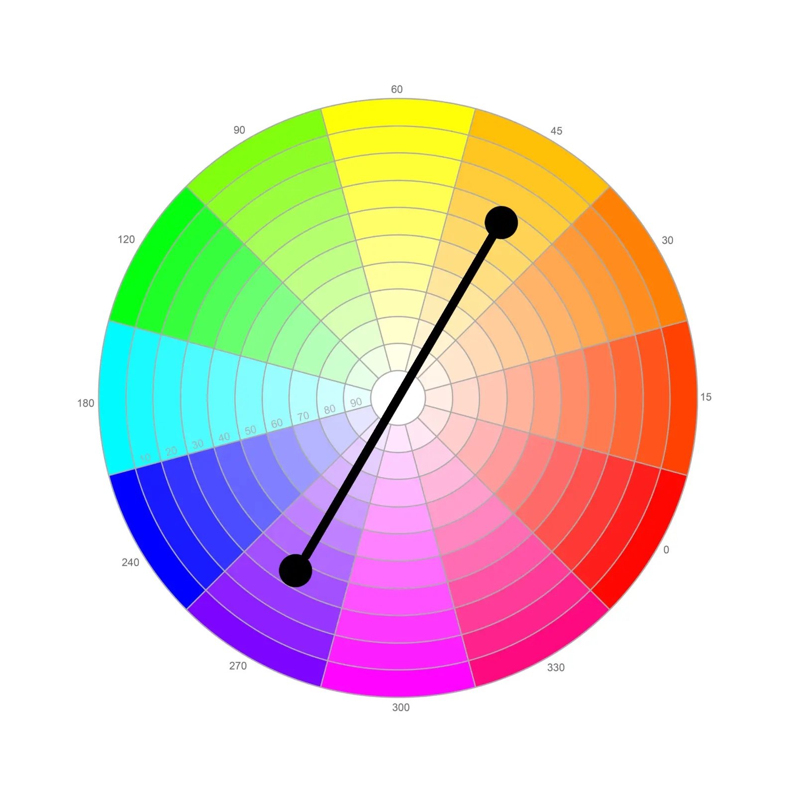
-
These are colors that are opposite on the color wheel. A complementary color scheme can communicate a sensation of energy and excitement.
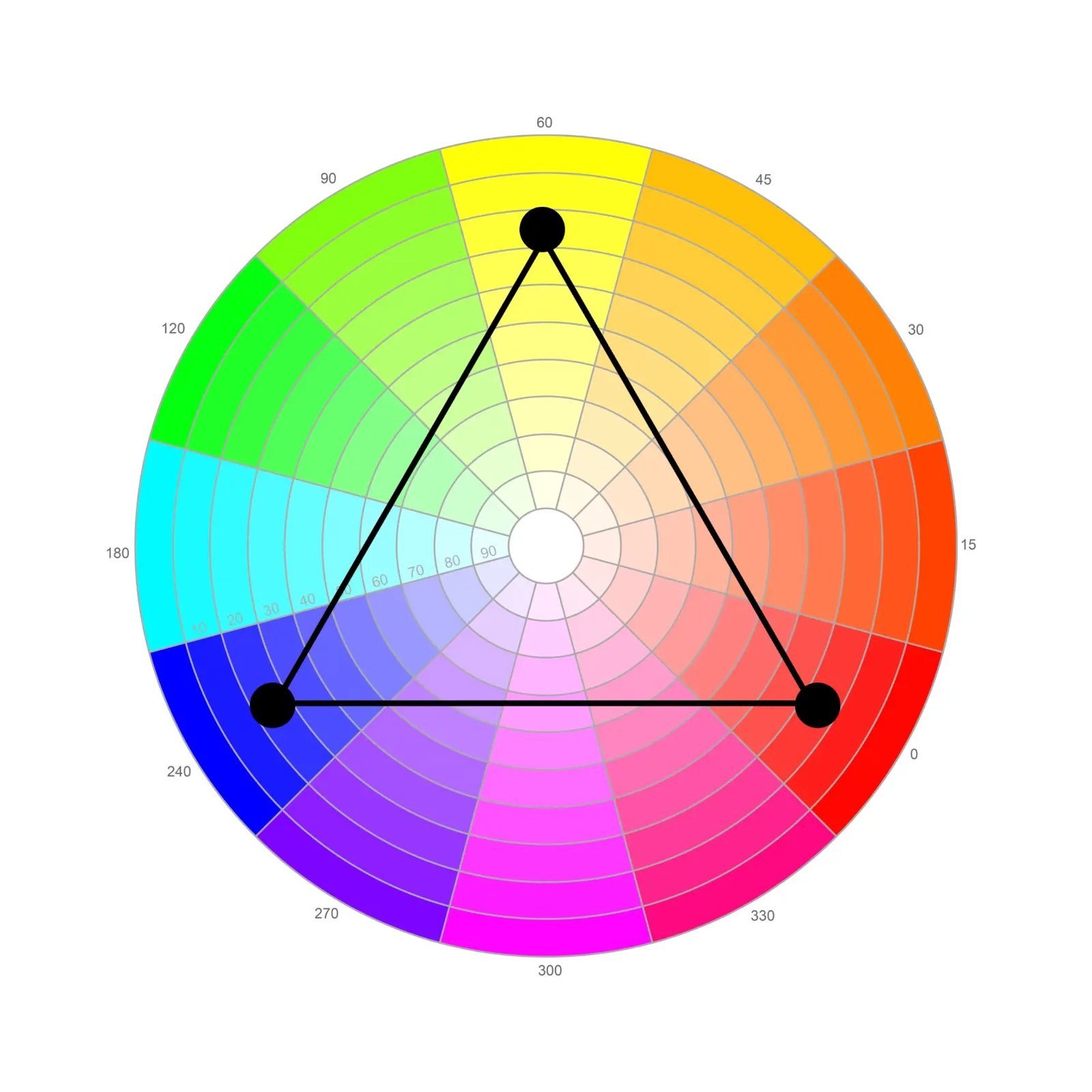
-
These are colors that are equidistant from each other on the color wheel. They are visually striking, but can require experimentation to get right. An example is red, blue, and yellow.
Of course, there are also a wealth of more complex color combinations to choose from. We recommend this tool to create your own palette.
3. Be intentional about your layout.
Now it is time to stitch together your fonts, colors, and visual elements into a design that communicates key information in a way that is both accessible and aesthetically pleasing.
pay attention to your hierarchy of messaging.
The most important components of your graphic should be visually dominant. Size or color should draw a viewer’s eye to the most critical information first.
Don’t be afraid of scale.
Increase the size of the type, shapes, and images you want to emphasize. Notice where your eye is drawn first in these effective examples.


Leave negative space.
The white space around your visual elements is just as important as the elements themselves. Make sure to leave plenty of cushioning around your fonts and images to highlight your design.
Below are some examples.


Repeat it.
Repeat colors, fonts, words, shapes, and other design elements both for aesthetic appeal and to help drive your message home. Notice how the repetition of shapes and colors creates continuity in the Instagram post series below.


Align it.
Align text and images. Add a line to create a sense of order.
Pay attention to space.
Make sure to give each element the space it needs. Do not decrease text so small it cannot be read, but also do not make it so large that it overlaps with other elements.
And of course, don’t forget to add your logo.
Pro tip: Use templates! We know that a lot of nonprofits don’t have the resources and profit for a full time graphic designer — but you don’t need a graphic designer on staff to make great graphics. There are thousands of professional design templates available for free on platforms like Canva that are easy to use and modify for your needs. Read our blog about Canva for Nonprofits to learn more and access over 250,000 free templates.
Now, you’re ready to get started. Good luck with your designs!
This post was written by Shirley Frame. Asibey Consulting has no affiliation with Canva. All of our reviews and recommendations are independently selected and we receive no compensation for them. For more insight on topics ranging from social media strategy to Asibey’s consulting work, follow our LinkedIn page.